
L’oxygène du web est un site où graphismes, icônes, thèmes et infographies ont la parole.
Nous parlons des sites et tentons de leur faire gagner un peu de visibilité en présentant leur visuel sur Oxgen Icons.
Parce qu’un bon site est un beau site, nous présentons non seulement le contenu de vos blogs et sites web mais aussi leurs composants graphiques, infographies et autres composants qui le distinguent des autres sites trop souvent fades.
Ceci a une grande importance à nos yeux !
Contraintes rédactionnelles sur Oxygen
Pour présenter un site, nous rédigeons un texte respectant les contraintes suivantes car nous ne mettons en avant que les sites de qualité.
- Le site proposé doit posséder une présentation graphique agréable et chargée de sens
- Les présentations d’un site doit contenir plus de 300 mots (si on en a moins à dire autant se taire)
- Le contenu d’une présentation est toujours unique
- Le vocabulaire de la soumission est toujours spécifique au domaine d’activité (pas de verbiage…), les verbes comme les mots sont adroitement choisis et les fautes d’orthographes … absentes !
- Les articles que nous rédigeons se doivent de présenter a minima l’activité du site « star » mais surtout ce pour quoi il a été mis en ligne
- Nous expliquons systématiquement comment le logo du site a été conçu, s’il a des sens cachés. Ce point est pour nous très important car notre site se veut respectueux des internautes et de la qualité des graphismes qu’ils seront amenés à rencontrer par notre intermédiaire
- Chaque site présenté sur « oxygen icons » doit avoir un favicon
- Les sites contenant du contenu enrichi dont des infographies sont favorisés
- Merci de ne pas faire de « keyword stuffing » sur votre site ou il sera écarté
- La lecture du texte se doit d’être fluide, si vous êtes propriétaire d’un site nous vous remercions de bien vouloir nous signaler toute erreur ou maladresse d’écriture
- Aucun site dont la morale pourrait s’avérer être douteuse ne sera publié sur « oxygen icons », exemple de ce type de site :
- poker ou autre jeux d’argent en ligne
- sites pour adultes
- « services » pour adulte
- incitation au racisme ou à la haine
- mouvements sectaires
- ventes d’armes
- vente de tout produit interdit dans l’espace Schengen
- apologie de l’alcool, tabac, cigarette électronique, drogue
- prosélytismes religieux
- …
Quelques exemples de logo qui marquent la toile
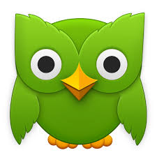
La chouette de Duolingo, « Duo », en est un bon exemple. Parce que les chouettes sont sages, et parce que Duolingo aide ses utilisateurs à apprendre de nouvelles langues.
Le logo en forme d’éléphant d’Evernote suit la même logique. Les éléphants, tout comme le carnet de notes dans le cloud d’Evernote, n’oublient jamais.

Le logo de Foursquare représente à la fois le jeu américain Four Square et l’une de ses fonctionnalités phares, le signe « check » utilisé pour le check-in.

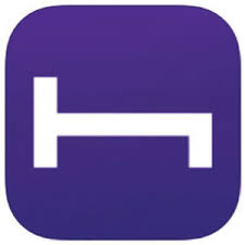
Le logo d’HotelTonight est à la fois un « H » et un lit.
Nos propres logos et designs
Nos propres sites sont édités avec ce soucis d’une présentation de qualité :